7 thoughts on “Shousetsu Bang*Bang no. 100 Cover ver. 4”
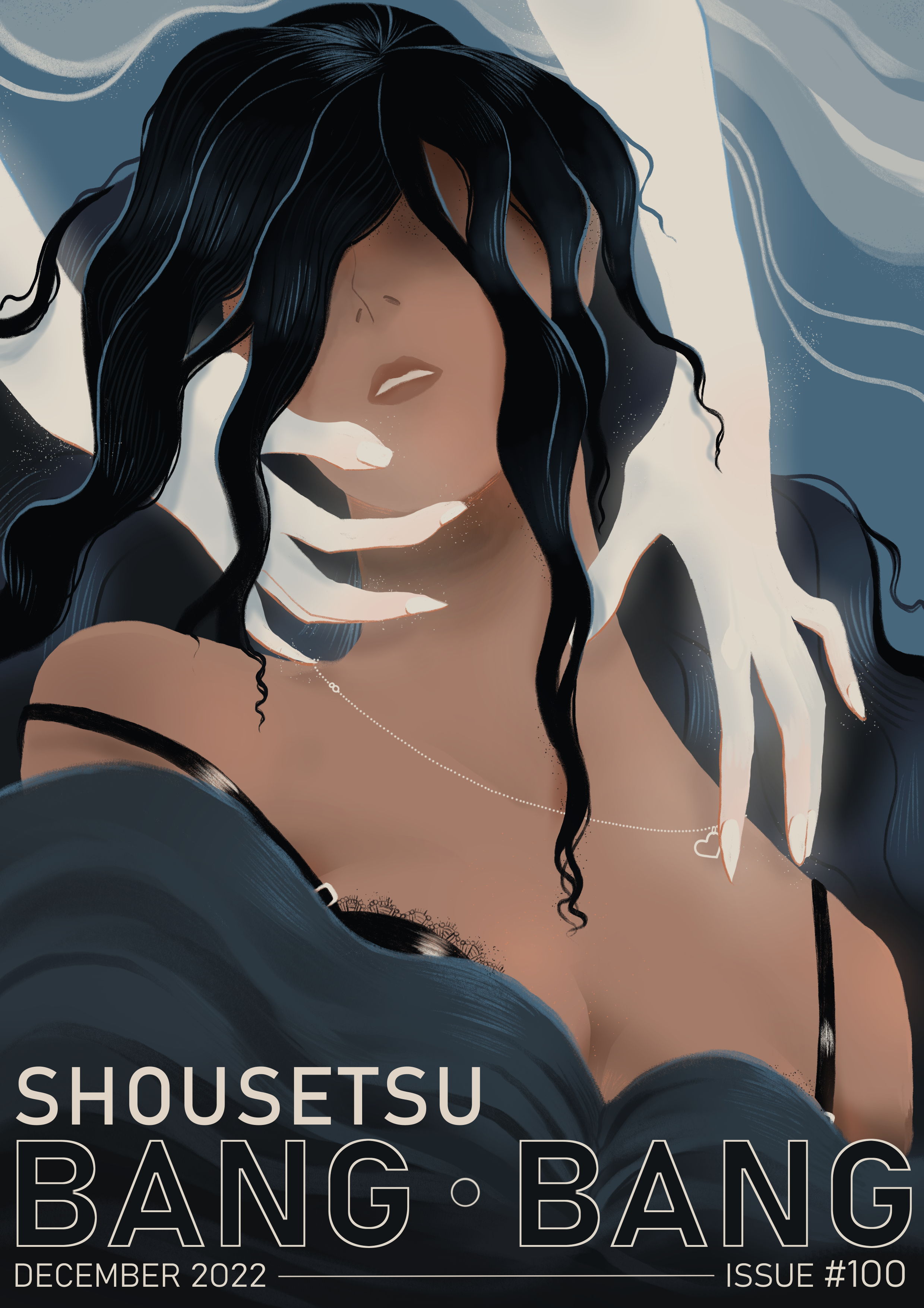
The classic poster/paperback design feel from this is delightful! Loving how the subtle shading and rendering of the colors encourages the eye to seek out finer details. The delicate-yet-threatening way you’ve drawn those hands makes the composition compelling, the delicate necklace standing out sharply against your central figure’s lovely neck and also drawing the eye to just how sharp those nails are. It really excites the imagination: is the necklace a gift from the ghostly visitor, or is it being twiddled with as a way to defy the original giver? I could see this hanging in somebody’s study, no question, and it’d deserve every dollar spent on framing it.
I love the use of the theme colors here — the blacks seen in the foreground figure’s hair and bra, while the different shades of teal are present in her shirt, parts of her hair and the background colors. Her skin and the ghostly figure’s (lack of) skin help contrast these perfectly. Such a good illustration.
I looove this, the contrast, the flowing lines, the spindly-fingered caress, the delicate little line of the necklace and the lace, it’s so sensuous and pleasing to look at.
this looks a little like an old movie poster to me and i love it. the composition, the colours, the typography — everything works together brilliantly. well done!
This gives me some Little Mermaid vibes, though I like that it’s very ambiguous if the lady is being rescued or possibly pulled under. I love the little hint of lace on her bra, it’s very pretty. Also weirdly fond of the fact the necklace clasp is showing. I almost never see that in art, but I can’t WEAR a necklace for any length of time without the darn things twisting around. It’s a really nice little touch!


The classic poster/paperback design feel from this is delightful! Loving how the subtle shading and rendering of the colors encourages the eye to seek out finer details. The delicate-yet-threatening way you’ve drawn those hands makes the composition compelling, the delicate necklace standing out sharply against your central figure’s lovely neck and also drawing the eye to just how sharp those nails are. It really excites the imagination: is the necklace a gift from the ghostly visitor, or is it being twiddled with as a way to defy the original giver? I could see this hanging in somebody’s study, no question, and it’d deserve every dollar spent on framing it.
I love the use of the theme colors here — the blacks seen in the foreground figure’s hair and bra, while the different shades of teal are present in her shirt, parts of her hair and the background colors. Her skin and the ghostly figure’s (lack of) skin help contrast these perfectly. Such a good illustration.
I looove this, the contrast, the flowing lines, the spindly-fingered caress, the delicate little line of the necklace and the lace, it’s so sensuous and pleasing to look at.
Wowww! Beautifully composed and executed
this looks a little like an old movie poster to me and i love it. the composition, the colours, the typography — everything works together brilliantly. well done!
This gives me some Little Mermaid vibes, though I like that it’s very ambiguous if the lady is being rescued or possibly pulled under. I love the little hint of lace on her bra, it’s very pretty. Also weirdly fond of the fact the necklace clasp is showing. I almost never see that in art, but I can’t WEAR a necklace for any length of time without the darn things twisting around. It’s a really nice little touch!
The way the necklace glows a little is quite stunning