5 thoughts on “Shousetsu Bang*Bang no. 100 Cover ver. 5”
I love your art so much.
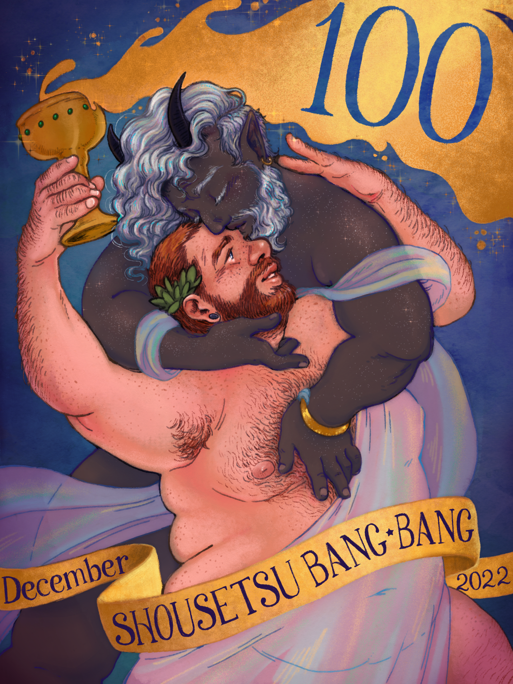
The colors here are fantastic, as usual, but my favorite part is the joyful shape of these characters: not just fat but DYNAMICALLY fat, their curves and softness still capable of exuberant movement that’s just so darn nice to look at. The rainbow sheen on the redhead’s drape is sublime! Also love the way you rendered the metal and made some great use of vignetting to add some subtle depth that really makes the whole thing pop. This is a very long-winded way for me to say “thank you for drawing some scantily-clad fat guys,” and I am grateful for your service.
This is drop down gorgeous — I love the homage (?) to antique advertising posters, right down to the soft touch and typography. Full of (positive) envy on how you made that gold look close to real life gold leaf! I concur on having this frame, most excellently done!
Oh, this is lovely! I’m not sure if it’s more of a god on god deal, or human being embraced by a god, but they’re both SO gorgeous and soft. The silvery hair is beautiful, and the little star freckles are just amazing. I feel like he would sparkle in motion and that’s fantastic. Also great integration of the text, especially the splash of gold coming out of the cup.


I love your art so much.
The colors here are fantastic, as usual, but my favorite part is the joyful shape of these characters: not just fat but DYNAMICALLY fat, their curves and softness still capable of exuberant movement that’s just so darn nice to look at. The rainbow sheen on the redhead’s drape is sublime! Also love the way you rendered the metal and made some great use of vignetting to add some subtle depth that really makes the whole thing pop. This is a very long-winded way for me to say “thank you for drawing some scantily-clad fat guys,” and I am grateful for your service.
This is drop down gorgeous — I love the homage (?) to antique advertising posters, right down to the soft touch and typography. Full of (positive) envy on how you made that gold look close to real life gold leaf! I concur on having this frame, most excellently done!
Love how you incorporated the text elements!
Oh, this is lovely! I’m not sure if it’s more of a god on god deal, or human being embraced by a god, but they’re both SO gorgeous and soft. The silvery hair is beautiful, and the little star freckles are just amazing. I feel like he would sparkle in motion and that’s fantastic. Also great integration of the text, especially the splash of gold coming out of the cup.
Second what everyone else said and I love the body hair too.