I do not know where to begin — this whole cover is fantastic!! I am such a sucker for a bullied salaryman but pair it off with the gratuitious use of the :9 face and a really excited dog and I am absolutely in love. And to be honest, real jealous of that cute bedspread!
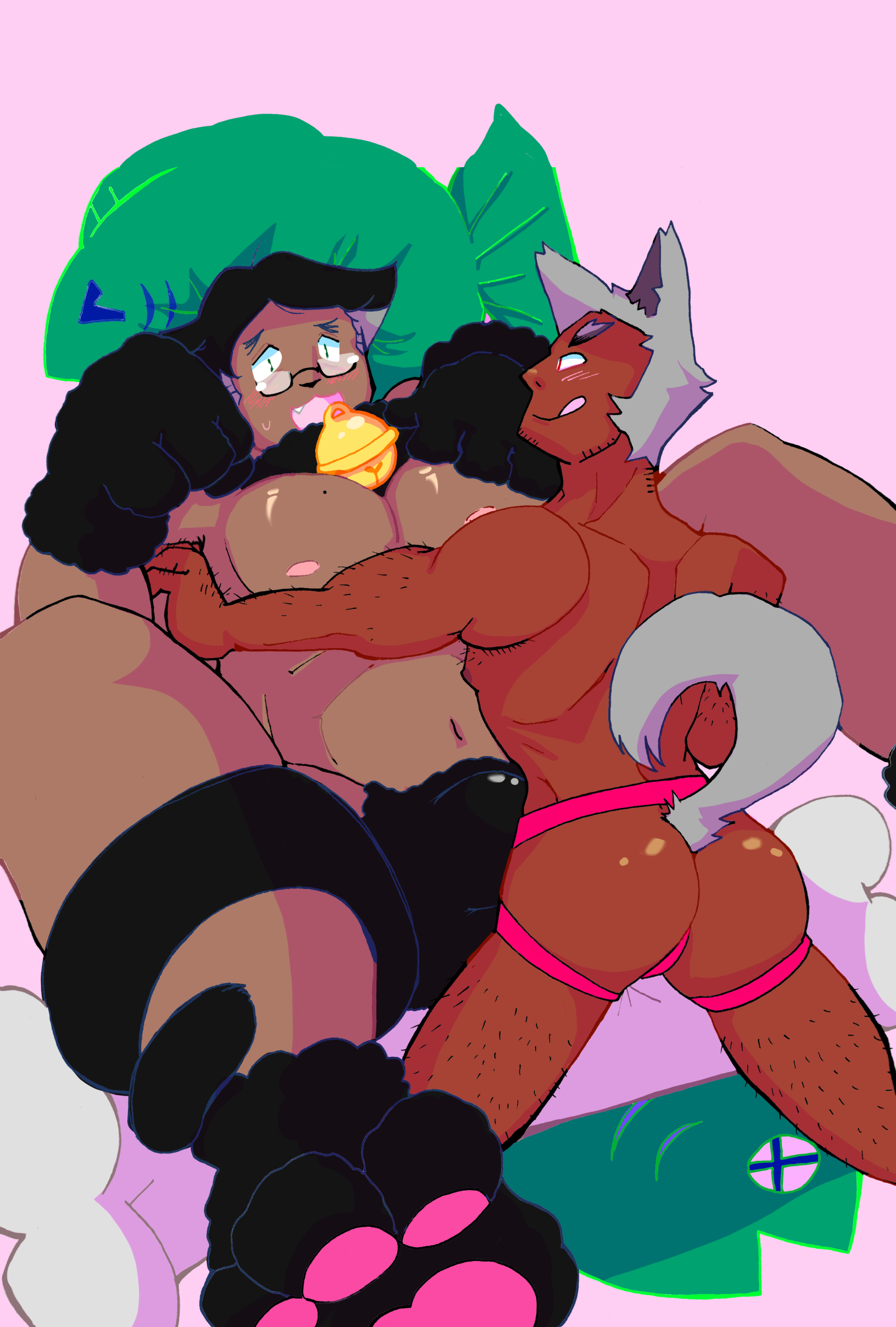
I love your color choices every time and this is no exception. I’m also really digging this cat man!! His expression is just so freaking flustered and cute and big beefy dudes getting flustered is wonderful.
1) Toe beans. 2) So colorful!! 3) Look at the shine on those tits, holy fuck. No wonder the dog is going for the cat gent, he looks like the world’s best squeaky toy. >:D
This is such a fun cover! I love the colors and shape design. I love the big cat himbo (?) and smaller dogboy top. Smaller tops/bigger bottoms are always great to see.
There’s so much energy and life in this, from the color choices to the shapes to the details like the fish- and bone-shaped cushions, and of course the expressions are great! I especially like the way the pastel background brings out the characters’ skin tones; as someone who draws on pastel canvases by default, it’s great seeing finished art that does the same thing out in the wild. What a great first cover!
I keep getting distracted by the little one’s ass. o,o So shiny.
The colors are luscious, and this is a super fun design! There’s a lot of great energy here. I really like the fun details like the fish pillow, it’s so cute!!!


I do not know where to begin — this whole cover is fantastic!! I am such a sucker for a bullied salaryman but pair it off with the gratuitious use of the :9 face and a really excited dog and I am absolutely in love. And to be honest, real jealous of that cute bedspread!
I love your color choices every time and this is no exception. I’m also really digging this cat man!! His expression is just so freaking flustered and cute and big beefy dudes getting flustered is wonderful.
1) Toe beans. 2) So colorful!! 3) Look at the shine on those tits, holy fuck. No wonder the dog is going for the cat gent, he looks like the world’s best squeaky toy. >:D
This is such a fun cover! I love the colors and shape design. I love the big cat himbo (?) and smaller dogboy top. Smaller tops/bigger bottoms are always great to see.
There’s so much energy and life in this, from the color choices to the shapes to the details like the fish- and bone-shaped cushions, and of course the expressions are great! I especially like the way the pastel background brings out the characters’ skin tones; as someone who draws on pastel canvases by default, it’s great seeing finished art that does the same thing out in the wild. What a great first cover!
I keep getting distracted by the little one’s ass. o,o So shiny.
The colors are luscious, and this is a super fun design! There’s a lot of great energy here. I really like the fun details like the fish pillow, it’s so cute!!!